The Environmental Emergencies Centre is a knowledge hub for experts working in the environmental and humanitarian fields. The Centre invites representatives from governments, communities, international organizations, the private sector and civil society organizations to strengthen their knowledge and skills for preparing and respondign to environmental emergencies. The website offers guidance, training, case studies and insights on a wide variety of topics. Users can find detailed mission reports, interactive online courses, information about key stakeholders, as well as a wealth of insights with the latest news, events and updates.
Since the EEC site contains a large variety of information and knowledge, how do you capture this breadth in a design?
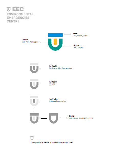
The EEC site’s logo aims to capture the diversity & the variety of the resources on the site. The colors all have a specific meaning, logic and purpose.
- Blue = sky / water / wind
- Green = soil / nature / ecosystems
- Yellow = sun / fire / drought
The EEC logo attempts to visualize what the EEC provides and represents in one simple figure. The logo holds the letter E and C, which stands for Environmental Emergencies Centre. The test tube shape in the middle of the icon represents industrial accidents, which are addressed by a majority of resources on the Centre. The shield shape of the logo represents the purpose of the website to better prepare and respond to environmental emergencies. The EEC shield strives to protect populations and the environment from the adverse effects of environmental emergencies.
Consult the logo here.
![]()